

E-commerce
Published by Nathalie De Martin
18 conversion increasing UX tips for web shops
PHPro researched the most important conversion-enhancing UX factors of several web shops. Below we release 18 effective tips to close every leak in your webshop and get the most out of your traffic.


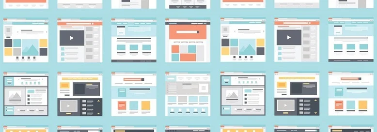
HOMEPAGE
USE CLEAR UNIQUE SELLING POINTS
Unique selling points or USPs are one of the main reasons why a customer will complete a purchase. So highlight these clearly and be specific e.g. “free return” or “not satisfied, money back”.
MAKE USE OF SOCIAL PROOF ON THE HOMEPAGE
Visitors like to read what others think of your online store. Feel free to capitalize on this and place positive reviews on the homepage.
USE CLEAR, DESCRIPTIVE AND ACTION-ORIENTED CTA'S.
Call-to-action buttons or CTAs should be clear and short. Above all, they should trigger visitors to take action, hence the name, of course. For example, prefer to use “View our collection” instead of “Read more”!

NAVIGATION
LIMIT YOUR HEADER MENU IN CHOICES AND SPACE
Don't give visitors too many choices. You don't want a virtual maze, but a well-organized web shop. Divide your navigation menu into clear and logical themes that reflect your webshop's offerings well.
DON'T LET VISITORS SCROLL IN THE NAVIGATION
Web shops with many subcategories can become long and confusing. The problem is mainly located on mobile (think mobile). Visitors will have to scroll to see everything. Research has shown that few visitors like to scroll down. So be sure to make the most of the space.
MAKE THE SEARCH FUNCTION VISIBLE
A good search function is sacred to Web shops. So it can certainly be important to place a search function well visible at eye level. The more a search function is used, the better the User Experience.

CATEGORY
MAKING A FILTER VISIBLE AND APPLYING IT
Always place a filter at a visible height above the fold (= the part of the website that is visible without scrolling). It is important that filters are easily visible to visitors, both on mobile and desktop. The faster visitors can filter, the easier visitors can find their items in the web shop.
CREATE THE RIGHT FILTERS
Without the right filters, chances are that visitors will get irritated. Suppose you don't have a filter where you can simply sort products according to price. It will then certainly not be easy to convince price-conscious visitors to complete a purchase.
MAKE USE OF APPROPRIATE PRODUCT IMAGES
Use images where the product is highlighted. Show images with the product from different angles on a neutral background. This way you highlight the product. In addition, users often want to see the product “in action.” So show an image in which the product is being used as well.


PRODUCT
USE CTAS THAT CONTRAST WITH THE PAGE
Make sure a CTA stands out. Therefore, possibly use a color that contrasts with your corporate identity. This way it stands out more. After all, a Call-To-Action button (e.g., “Add to Cart”) must be irresistible!
HIGH-RESOLUTION IMAGES WITH ZOOM-IN OPTIONS INSPIRE CONFIDENCE
Show high-res product images that are zoom-in. This allows visitors to view the product in the deepest detail and gives them more confidence in the product. As a result, they will hesitate less and convert faster.
PRODUCT INFORMATION DOESN'T HAVE TO BE A BOOK, USE LAYERS
You certainly don't have to write a book to make a product description complete. Use a clear visual hierarchy in the layout of your content (product description, specifications, reviews and more)! Short bullet points are more effective than long text on a product page. Adding a “read more” section to your product description helps to layer heavy content.


FORMS
LIMIT THE NUMBER OF FIELDS
The more fields you create, the more visitors have to think. They are true obstacles. In addition, the extra fields can cause mobile to require much more scrolling. Our many tests have shown that less than 50% of visitors scroll all the way down. Want a heatmap study of your own where you can visually see how visitors interact on your website? Then be sure to contact PHPro and we will tell you how we proceed to increase the UX of your website!
MARK REQUIRED FIELDS WITH AN ASTERISK AND COLOR
Let visitors and leads know clearly what is expected of them. Certain information is simply necessary to properly process certain services or products. You can use asterisks for the mandatory fields by default. A bright and challenging color immediately informs a visitor where they have filled in a field incorrectly or not at all.
PASSWORD SECURITY IS IMPORTANT, BUT DON'T MAKE IT TOO DIFFICULT
In these technological times, protecting personal data is a must and indeed an obligation for companies with a wealth of personal data. Having visitors register with a strong password is certainly good, but don't make the process too complex either.
Requiring them to create a password with 15 characters, 2 characters including capital letters and numbers is a stretch. Give leads the ability to create a strong password, of course, but don't mandate it. An excellent password is unique and, practically speaking, can easily be a little shorter (Note: not too short). Offering a 2nd authentication method (e.g. Google Authenticator, SMS, ...) immediately provides a double layer of protection and a great UX.

CHECKOUT
SHOW A PROGRESS BAR IN THE CHECKOUT PROCESS
People love an overview and thus a progress bar. Seeing the next steps is a kind of overview to a goal. This is sometimes a process that your leads enjoy following.
OFFER A GUEST CHECKOUT OPTION
A guest checkout removes any obligation to create or register an account. This is often an obstacle for users who want to order quickly or don't want to create passwords. By removing this obstacle, users will flow through the checkout faster.
HIGHLIGHT THE BENEFITS OF AN ACCOUNT
A visitor must always be convinced of the many benefits of an account. Creating an account always requires a serious effort from your leads. They literally have to give up their personal information, come up with a password and spend more time on your website for administrative work. Always include at least 3 reasons why creating an account is a benefit to your leads. Offering a discount can also win over a visitor.
Receive our 41 UX tips in a perfect white paper?
With 18 of our 41 UX tips, you already have a taste of our knowledge to boom conversions in your webshop. Feel free to contact us and request our whitepaper via email!